HipChip
Group Gifting Application

HipChip is a platform designed to make group gifting easy and hassle-free. The platform allows users to collect contributions from a group for a wide variety of occasions, including birthdays, teacher gifts, baby showers, and weddings. However, HipChip’s website and application was outdated, and they needed a fresh, responsive design to enhance the user experience and improve conversion rates. My role was to lead the UX/UI redesign of the website to ensure it became more user-friendly and aligned with the company's goals.
My Role: UX Research, Information Architecture, Prototyping, Interaction Design, UI Design, Conversion Rate Optimization
To begin, I conducted stakeholder interviews with the HipChip team, which included parents, teachers, coaches, and PTA members. These discussions helped me understand their pain points and the expectations for the website. We gathered insights into their group gifting experiences and noted the friction points they encountered with the previous design.
Key Insights:

After gathering initial research, I performed usability tests on the existing platform with a small group of target users. This allowed me to pinpoint specific pain points:
I analyzed several competitors in the group gifting space to better understand their UX strategies and opportunities for HipChip to stand out. Competitors such as GoFundMe and GiftCrowd had smoother user flows, a more modern visual style, and easier gifting processes. These findings were used to guide design decisions aimed at making HipChip a leader in its space.

Armed with research insights, I led brainstorming sessions with the HipChip team to define the core objectives of the redesign. The goal was to simplify the user flow, enhance the site’s visual appeal, and improve responsiveness across devices. We defined the core features and aligned on the primary user goals:
I also collaborated closely with stakeholders to refine the website’s information architecture using card sorting techniques. This allowed us to streamline the user journey, ensuring that key actions like setting up a gift, inviting contributors, and delivering the final gift were accessible and intuitive.

Next, I created low-fidelity wireframes to visualize the new site layout. This included:
These wireframes were shared with the HipChip team, allowing us to agree on the flow and structure before moving into high-fidelity design.

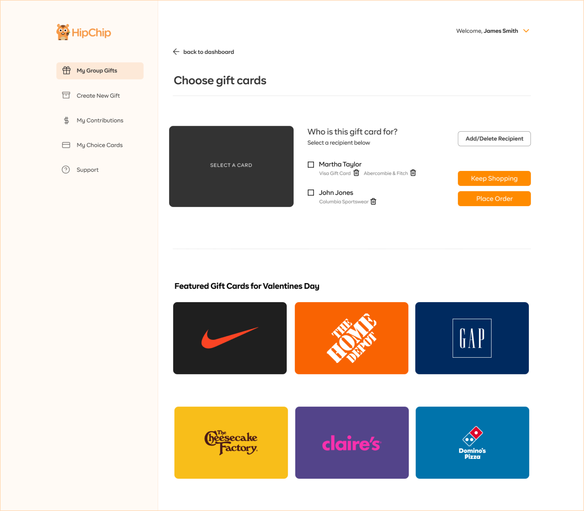
In the high-fidelity designs, I focused on making the platform feel fresh, modern, and approachable. I incorporated HipChip's playful and friendly brand identity through:
I also ensured that calls-to-action (CTA) were strategically placed to guide users through each step, helping to optimize the conversion rate.


To maintain consistency across the HipChip platform, I developed a design system that included a set of reusable components and guidelines. This system ensured a cohesive user experience across all pages and devices.


The new HipChip website was launched with a significant improvement in usability and user satisfaction. Key outcomes include:
This project was a rewarding challenge that allowed me to showcase my skills in UX research, information architecture, and UI design while solving complex user experience issues. The final result was a modern, responsive, and user-friendly website that enhanced the overall group gifting experience for HipChip's users.
